about
Product Design
UI Design
Branding
Film
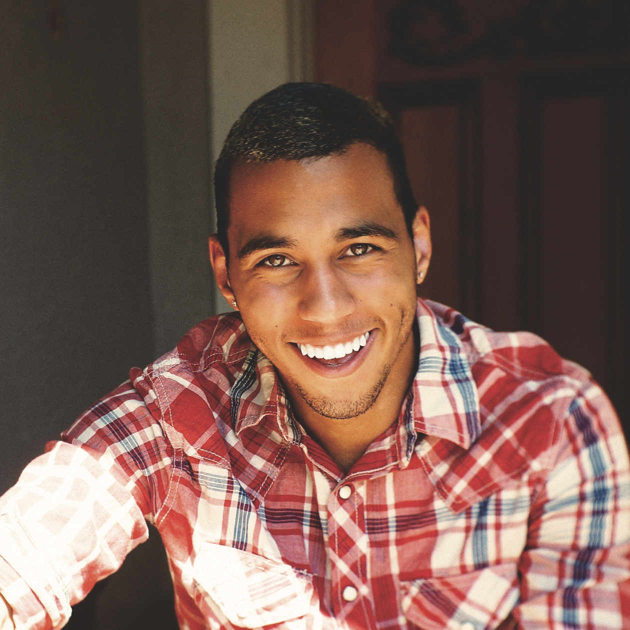
Bryce Daniel
Visual Storyteller
I am a CA | NY based freelance designer with over five years of experience in graphic design, illustration, and motion design. As a student of the internet, I relish the opportunity to add new techniques to my skill set and work on challenging new problems. I believe in the power of design and its ability to change the way we interpret the world around us. Following a minimalist philosophy, my work reflects a dedication to reduction as I strive to create bold concepts, saying more with less.
While I have worked the longest in branding and traditional graphic design, I have more recently discovered an affinity for UI design as well. Translating my personal design principles into user interfaces, I create simple solutions to complex problems for mobile and web platforms. I believe design should surprise and delight you for seemingly no reason, because UI done right, you'll never even notice.
More than pixel-perfect designs, I create user useable experiences and tell brand stories that matter. True design invokes emotion and crafts a relationship between product and user. Scroll down to see what I can do for you.
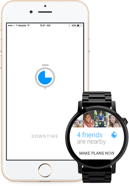
Spend free time with friends
TL;DR
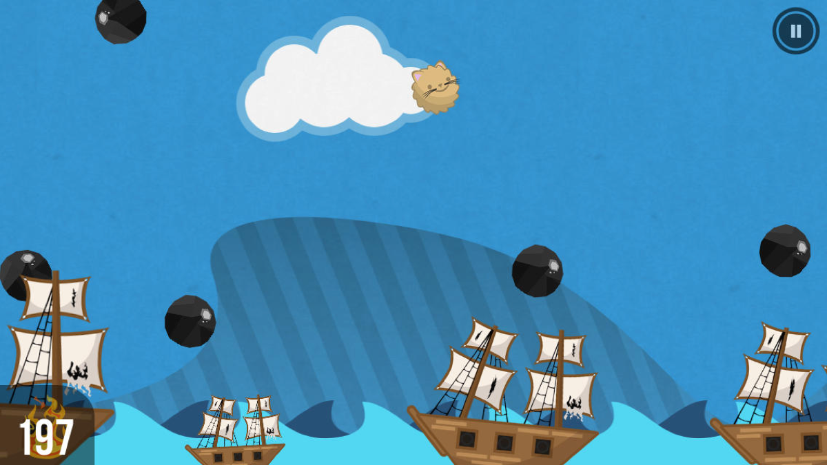
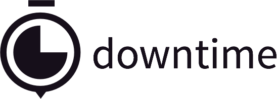
Downtime is a fast new way to hangout with friends. It is an iOS and Android app that provides a simple way to find nearby friends and suggests activities to do together in your free time. By relying on a clear visual style and intuitive functionality, I created a friendly user experience that allows you to spend less time in the app and more time with friends. On Android wear, the experience is even easier thanks to context aware notifications.
Client
Self, Concept / Side Project
THE PROBLEM
Between class schedules, jobs, and other commitments, it’s difficult to know when your friends are free to hang out. Once you’ve found some available friends, it’s hard to find something to do.
- Different schedules
- “I Dunno” decision-making
- General distrust of location sharing
Solution
Create a simple way for friends to quickly share their availability and location, as well as find activities to do with one another.
- Instantly know who’s free
- Relevant activity suggestions
- Share location only when available
Target Demographic
While Downtime can be used by anyone, from teens to adults, it was designed with college students in mind. As a student, I know the frustration of group chats when it comes to finding a free friend. I also knew I couldn't be the only one unsatisfied with the status quo, so I did some research and discovered a need.
RESEARCH
I performed informal questioning and observation of the behavior of 25 of my friends in order to confirm the need for Downtime.
- 25/25 relied on sending text or similar messages to friends in hope of finding someone available to hang out with. Most admitted they had 2-5 active group chats.
- 20/25 expressed a fear of missing out (FOMO) on weekends.
- My friends had an average of 15-25 hours of free time per week, primarily spent on Netflix and social media. However, most indicated they would rather spend more time with friends.
- When asked if they trust "Share your location" apps, several admitted they were not comfortable with “everyone seeing their location.”
Design
Approach
Everything about the design process was centered on providing the best user experience. Envisioned for use during free time, moments when users want to take a break and relax, the design needed to be friendly and intuitive. The process had to take as few steps as possible and never appear confusing or frustrating. For this reason, I chose a Material Design approach because it inherently aims to delight. The light color palette and familiar interface patterns make the overall experience a pleasure to use, rather than a chore.
- Clean visual style
- Natural progression through app
- Familiar interface
Sketches
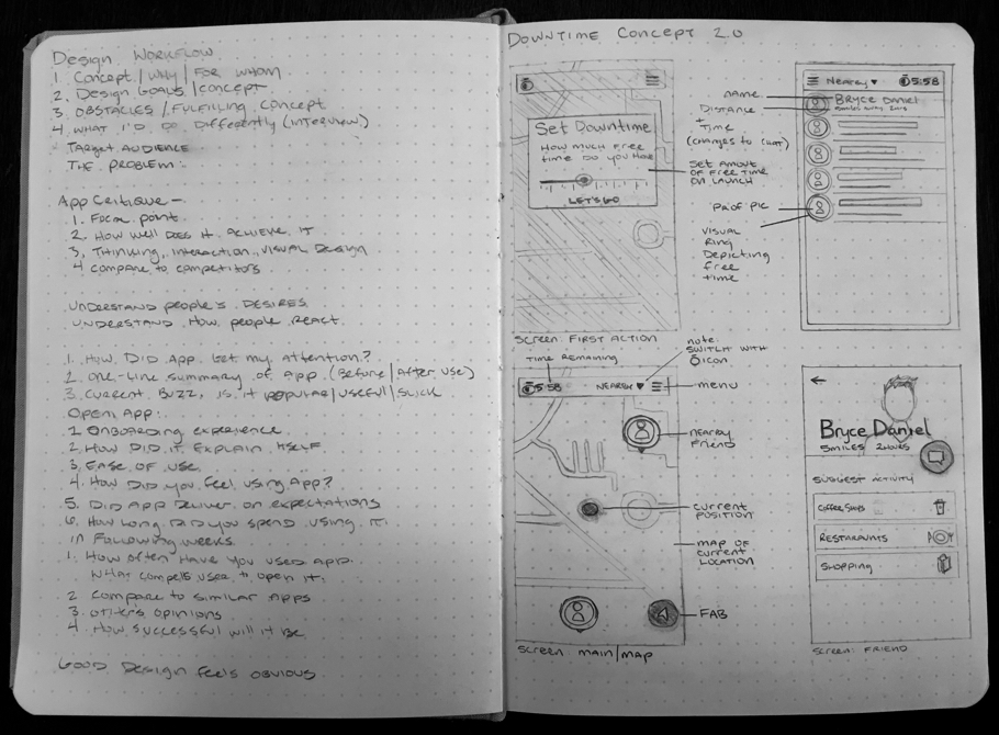
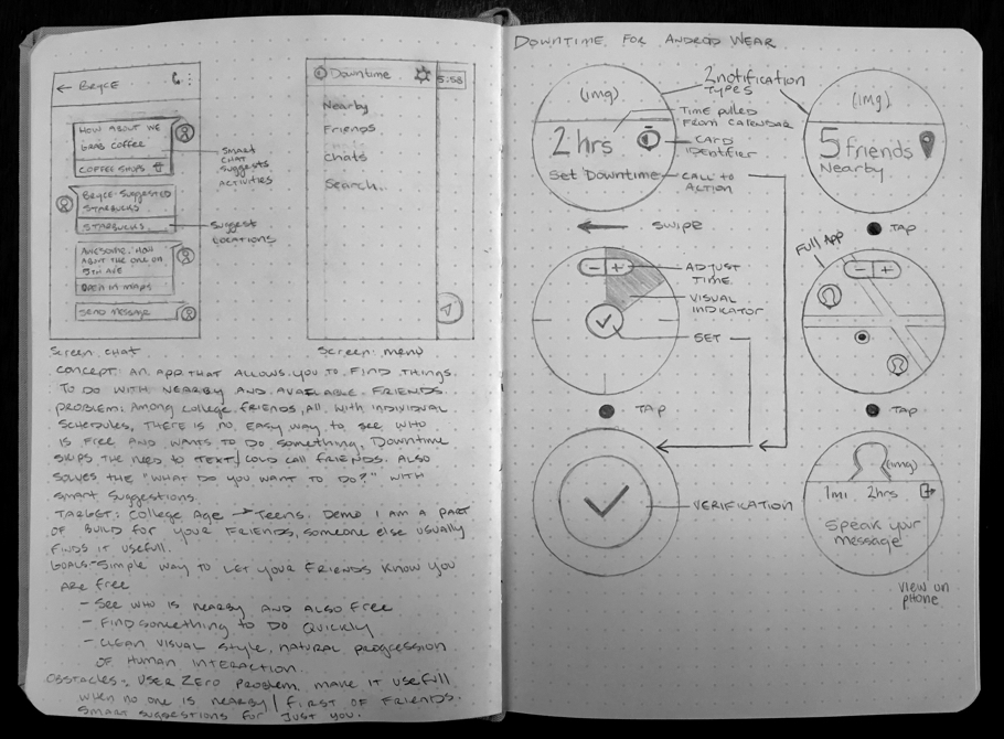
Design is never just about making something pretty. Starting on paper allowed me to imagine user flows before I started playing with pixels. Initial sketches are usually messy rectangles with scribbled text and arrows that don’t mean anything to anyone but me, so here are some of the final ones. You can see a lot of them translate directly to the final design.
Hi-Fidelity Mockups
Launch Screen
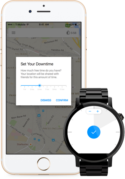
I decided users should set their downtime before anything else, because without it, the app cannot function properly. I ultimately settled on a map view with an overlaid dialog card to:
- Set the downtime
- Explain how long the user’s location will be shared
- Subtly suggest the result of setting their time
Additionally, by only allowing users to see their friends’ locations after they have shared their own, the app creates a sense of trust among users.
On your Android Wear, simply swipe on the context-aware notification and adjust your suggested downtime.
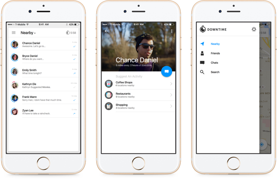
Nearby Map
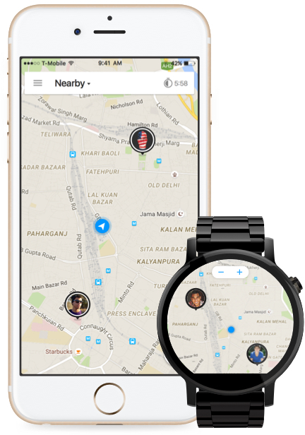
The map is the home state of the app. From here users can instantly see who’s nearby and free to hang out. A map seemed the most familiar way of visually representing location, but swiping down on the top bar reveals a list view of nearby friends as well as current chats.
- See free friends
- Tap and chat
On your Android Wear, map out your closest friends at a glance.
Smart Chat
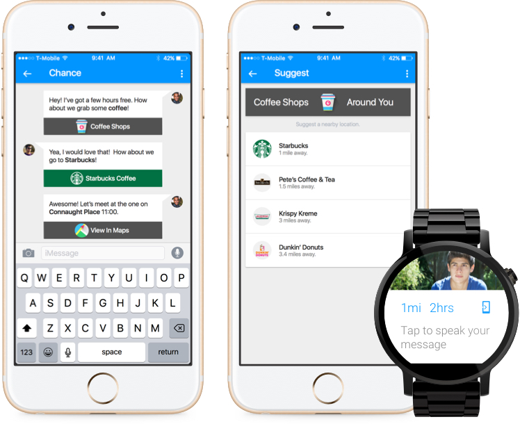
As discovered in research, most people turned to a messaging application for making plans. I wanted to make chat do more for the user. Downtime’s Smart Chat is a messaging system that feels at home in a time of digital assistants.
- Pulls out key words and suggests nearby options for activities
- No more “I dunno” in response to “what should we do”
- Disappears after set downtime is up
On your Android Wear, message them from your wrist or continue making plans on your phone.
Notifications
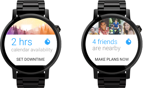
The best app is the one you never have to open. Downtime invisibly lets you know you have some free time with a gentle nudge. And with context aware notifications, Downtime for Android Wear lets you know when friends are nearby.
Challenges
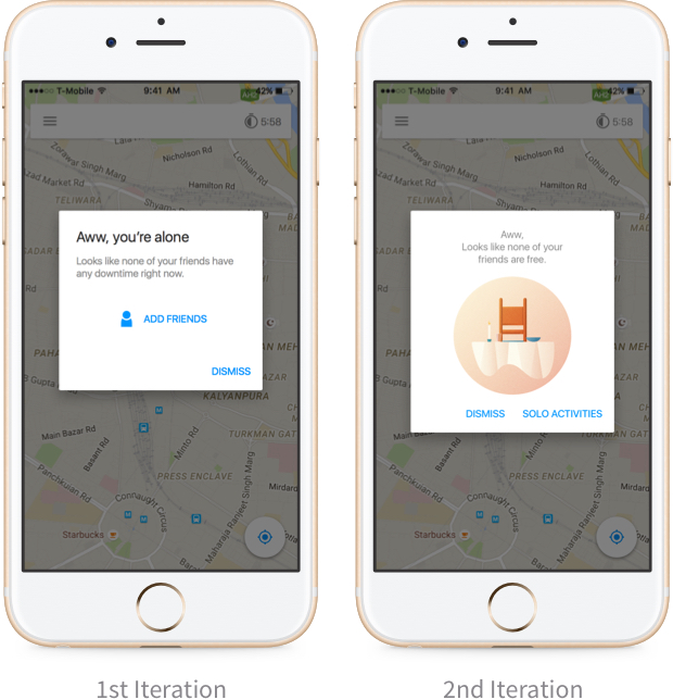
An app that relies on location sharing and friends setting their downtime faces the “empty state” challenge. What happens when none of your friends are on? Initially I designed an “add friends” alert, but I wanted the app to be useful even when you are by yourself. In the second iteration, Downtime now suggests activities that are perfect for those “table for one” moments.
Close
More than a church
TL;DR
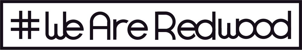
#WeAreRedwood is a church-wide marketing campaign in order to promote Redwood Covenant Church and increase congregation membership. I created bumper stickers, business cards, posters, as well as wrote and performed a short poem for a commercial played in the local theater.
Client
Redwood Covenant Church
The Ask
The client asked for a visual identity to accompany the hashtag #WeAreRedwood in the form of stickers and a poster. They also wanted ideas for a 15 second commercial.
- Simple yet distinct
- Bold and cohesive
Solution
Create a strong brand that can be adapted to fit the various application needs of the campaign complete with original photography and poem.
- Immediately recognizable
- Meaningful and inspiring verse
- Resulted in increased awareness of RCC
Target Demographic
Although a younger crowd also attends the church, the congregation is made up of primarily older adults, many of whom did not know what a hashtag is. The campaign was directed at friends and neighbors of these existing members and regular attendees.
Design
Approach
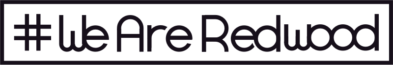
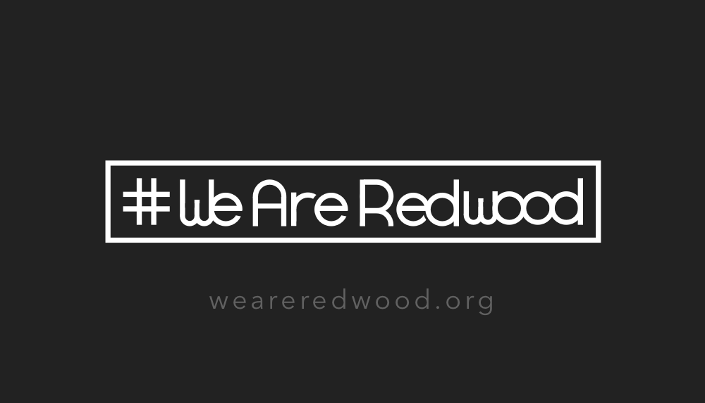
Knowing that the final design was going to be a wordmark I skipped the usual preliminary sketches and typed out “#WeAreRedwood” in a few different typefaces. Unsatisfied, with the lack of visual distinction, I set about creating my own glyphs. Wanting a clean and bold mark, I emphasized curves and used basic geometric shapes. Connecting the shapes gave it a more unique appearance, and the bounding box was added to give it a unified feel that I felt embodied the cohesive nature of our church.
- Crisp lines
- Identifiable at many sizes
- Unique apart from general fonts
Early Iterations
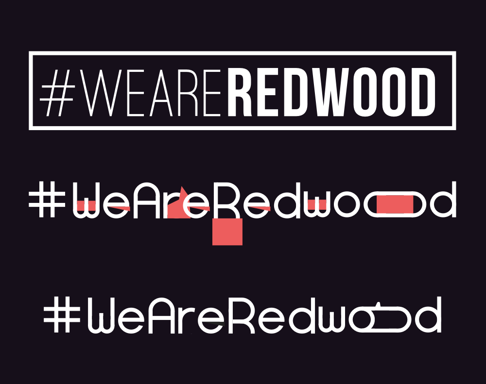
Here you can see some visual explorations with the “wood” as well as the masking shapes created to carve the glyphs out of simple circles and rectangles. The last one was well received, but ultimately deemed too distracting.
FINAL MARKETING MATERIALS
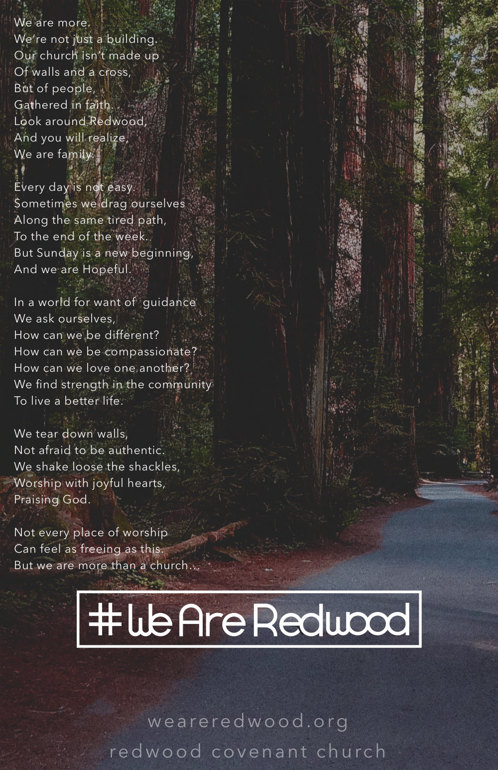
Poster
Business Card
Poem
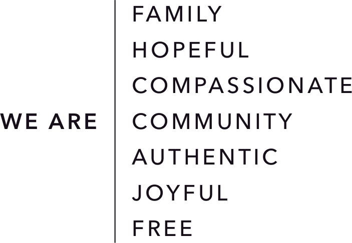
We are more.
We’re not just a building.
Our church isn’t made up
Of walls and a cross,
But of people,
Gathered in faith.
Look around Redwood,
And you will realize,
We are family.

Every day is not easy.
Sometimes we drag ourselves
Along the same tired path,
To the end of the week.
But Sunday is a new beginning,
And we are Hopeful.

In a world for want of  guidance
We ask ourselves,
How can we be different?
How can we be compassionate?
How can we love one another?
We find strength in the community
To live a better life.

We tear down walls,
Not afraid to be authentic.
We shake loose the shackles,
Worship with joyful hearts,
Praising God.

Not every place of worship
Can feel as freeing as this.
But we are more than a church…

#WeAreRedwood
Commercial
Challenges
The biggest challenge was creating a mark that was more than the hashtag printed in a sans-serif typeface. By creating my own glyphs, I was able to create a unique logo that grew to become something recognizable and displayed on cars all over town.
Close

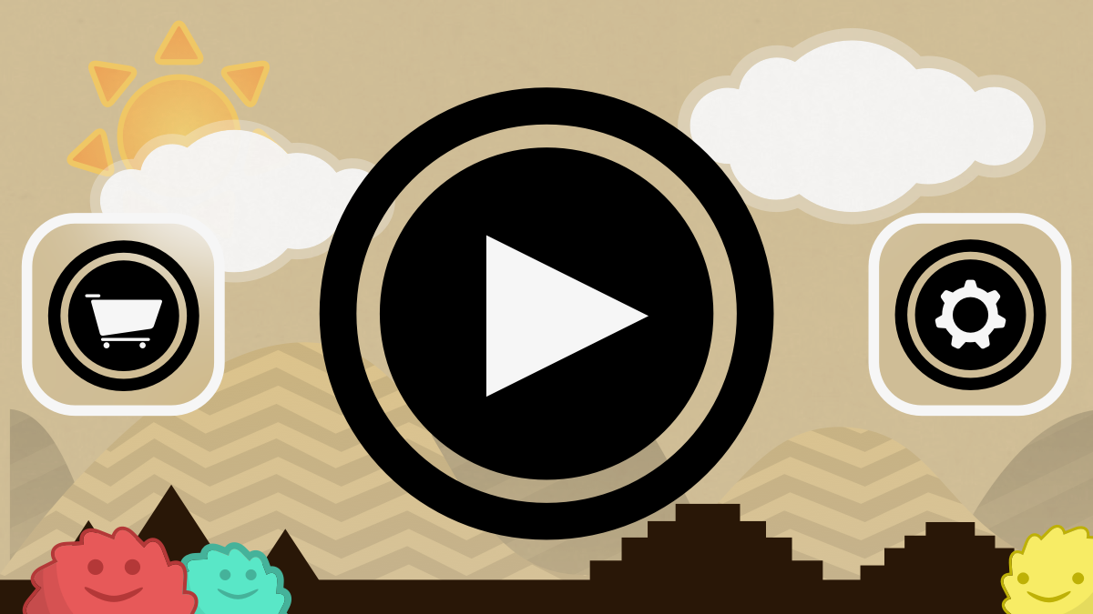
A deceptively simple physics game

TL;DR
Gon is a highly addictive iOS game that has been downloaded thousands of times and currently has a 4.5 / 5 average rating in the App Store. In the first week it was ranked top 40 in Adventure Games Category and Top 300 in All Games. Ultimately sold to another company.
Team
Sole designer on team with 2 other developers
The Goal
The two developers came to me for help with creating a simple side-scrolling iOS game. We wanted it to be cute and fun, but also challenging and addictive in its gameplay.
- Simple in theory; difficult in practice
- Fun visual style
Solution
Create a game with deceptively simple, yet addictive game mechanics and a huggable hero.
- Single action gameplay
- Loveable GonGon characters
- Easy to pick up; hard to put down
Target Demographic
We aimed for the casual young gamer niche ranging from kids to late teens. To capture a pre-teen audience, I created graphics with fun colors and textures that would appeal to kids .
Design
Approach
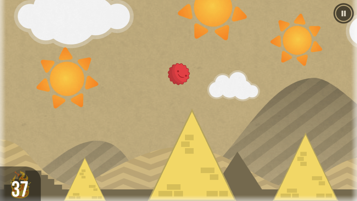
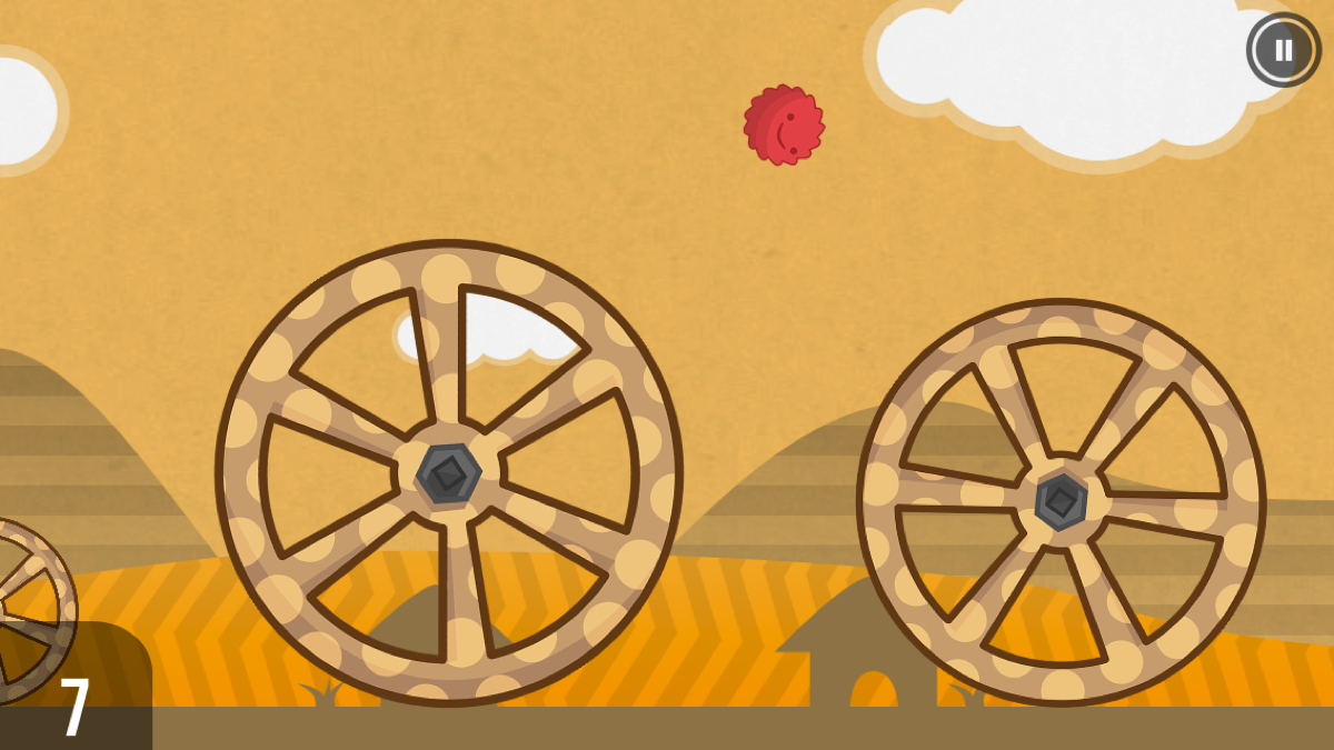
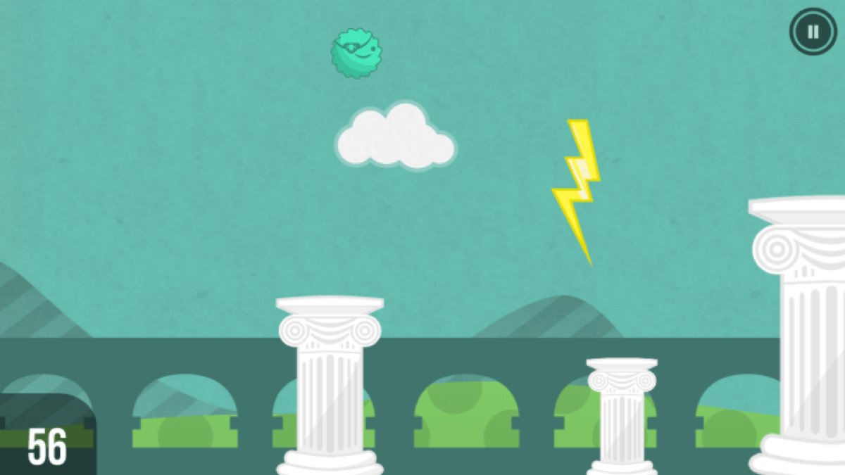
The game follows the cute GonGon as he travels through time and 9 different levels, each with their own theme and obstacles. The player draws a line to bounce on or uses the geometrically-inspired barriers to propel forward.
- Simple shapes
- Fun textures and patterns
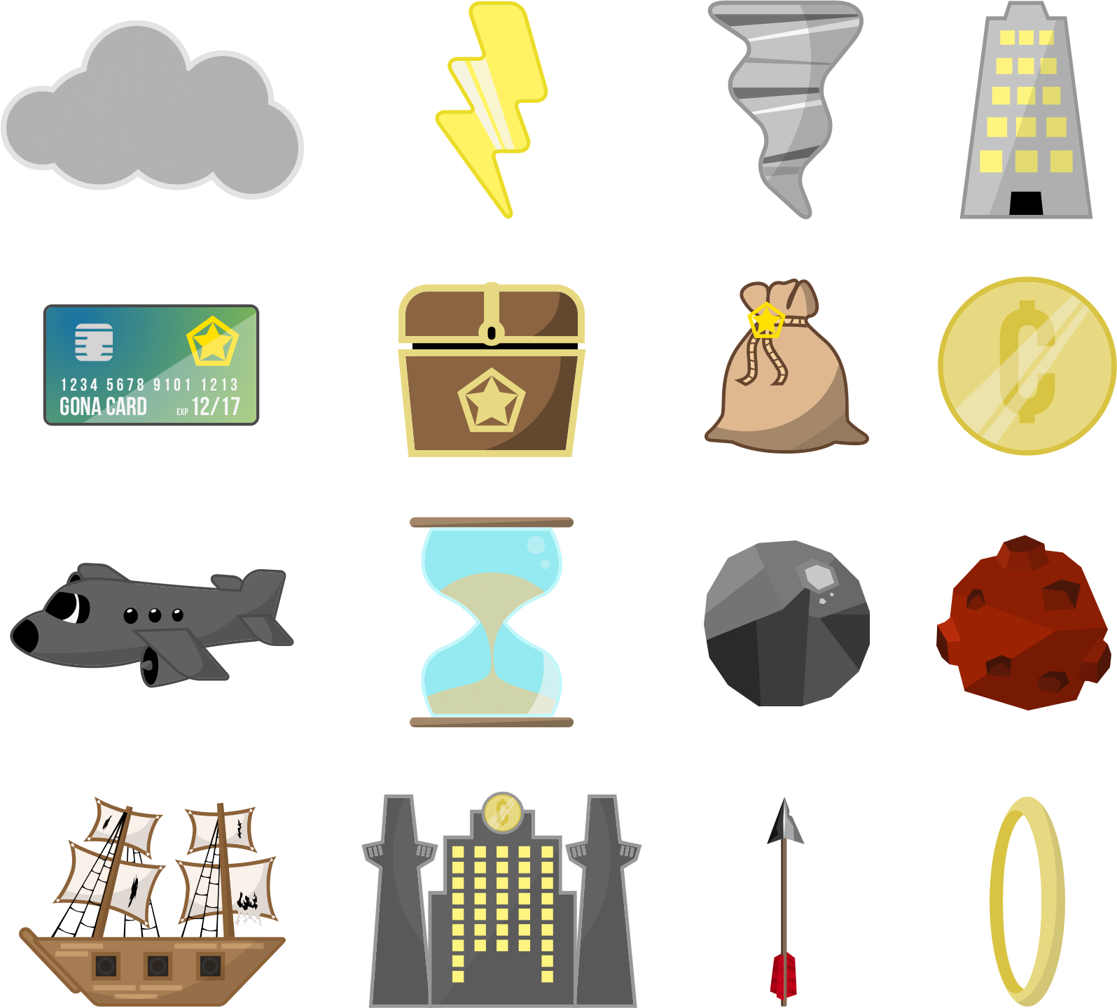
Game elements
Characters
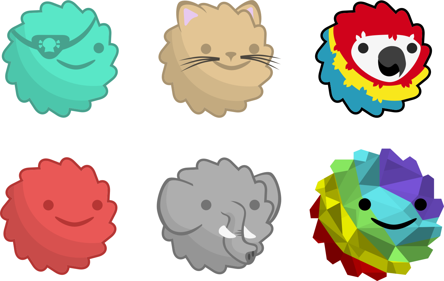
Obstacles and Powerups
Reviews
"Gon looks and sounds great and has a unique gameplay and a good amount of character to help separate it from the rest of the casual game crowd on the App Store."
-Today's iPhone
"A cute and fun action/physics game that provides a tough challenge."
-148apps
Challenges
Making a game that stands out from the rest on the app store is no easy feat. This was the teams first endeavor into game development so it was a bit of learning on the go. Creating game assets that were visually appealing but easy to implement beyond the mockup was a matter of finding the right balance between aesthetic and functionality. We sold the game to an interested company because we did not have the platform to market it as well as they would be able to.
Close
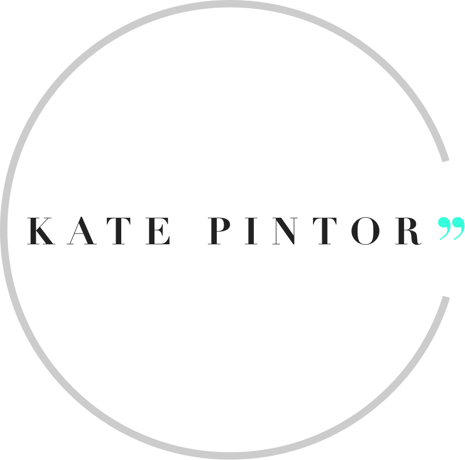
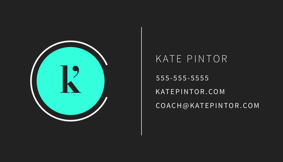
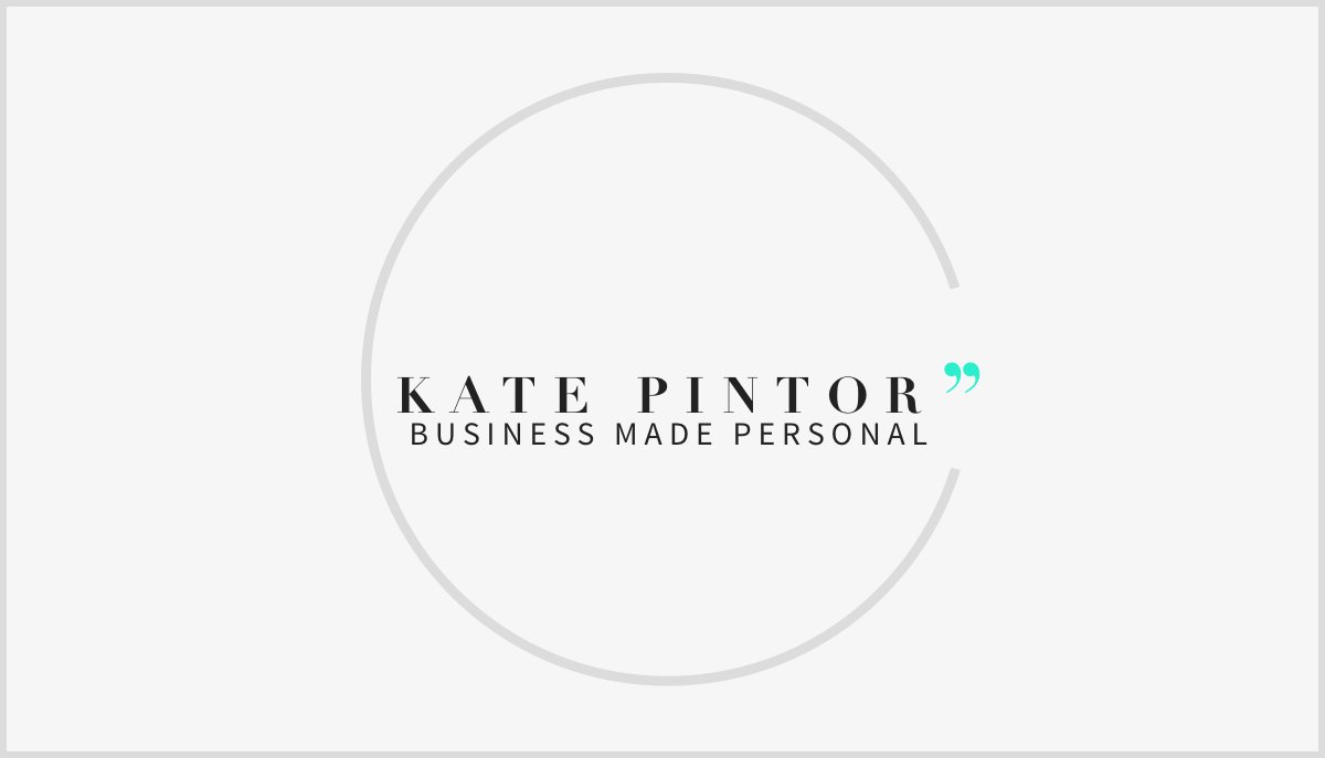
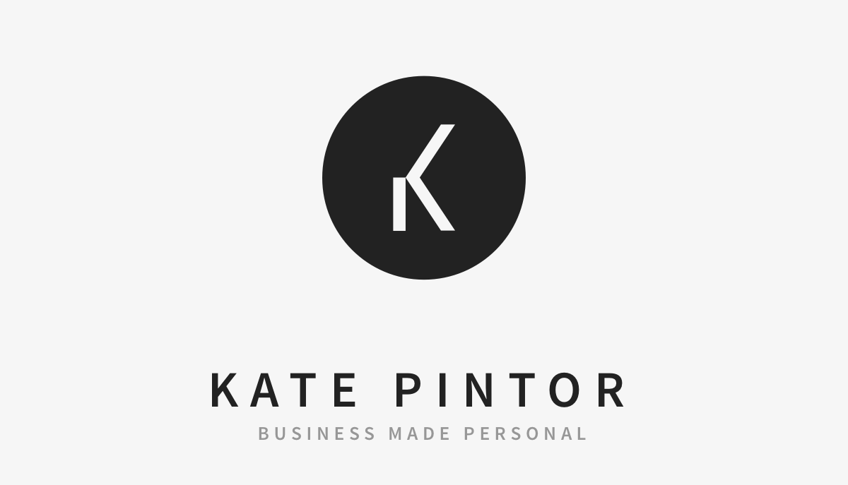
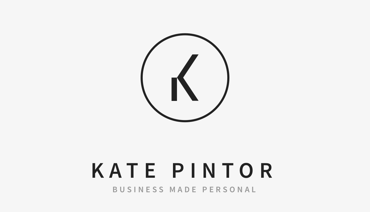
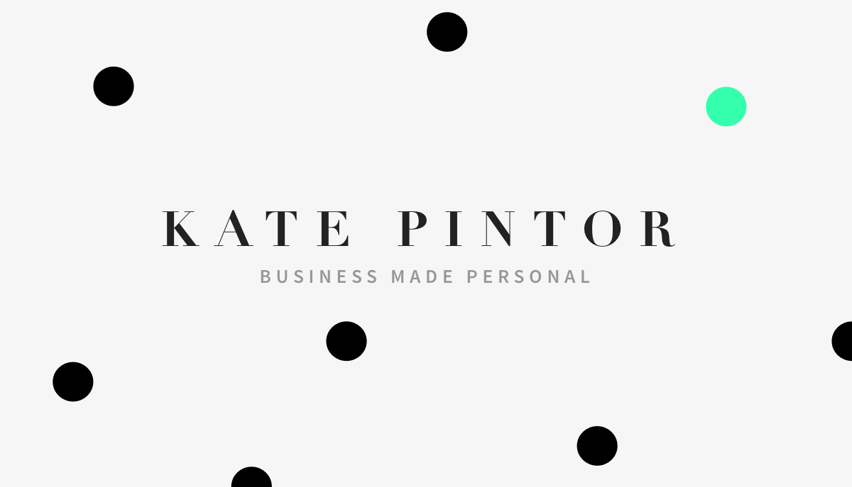
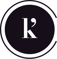
Business made personal
TL;DR
The K’ mark is the personal brand of Career Coach Kate Pintor. The logo represents an elegant yet friendly approach, and the distillation of a philosophy down to its core: Business is personal and conversation closes the gap. The project involved a main logo, secondary logo, and business card.
Client
Kate Pintor, Entrepreneurial / Career Coach
The Ask
Kate came to me with a few ideas for a visual identity but no real brand clarity. The logo needed to represent her as well as her philosophy that business is very personal.
- Inviting, trendy, pretty
- Clean and clear
- Minimal color palette
Solution
Create a refined, elegant mark and auxiliary logo that embodies her desire to help entrepreneurs find their voice so they can have meaningful conversations with their clients. The logo is based on Kate’s name to make the brand inherently more personal.
- Single quote, iconic symbol of dialogue
- Double quote, conversation closes the loop
- Bold, minimal, instantly recognizable
Target Demographic
Kate’s clientele is primarily entrepreneurs who have built successful business plans but are frustrated by their inability to attract loyal clients. She helps them find balance in their lives and make lasting connections. I wanted her logo to appeal to the professional community while retaining an openness and playful quality.
Design
Approach
Both designs above are featured on the business card. Clean simple lines and the use of space creates a sense of balance and sophistication. The pop of color adds a bit of fun and friendliness to an otherwise stark design.
- Bold Colors
- Minimalist approach
Early Iterations
Unfortunatly I no longer have initial sketches for this design. However, some of the early iterations show the progression. From the beginning I knew I wanted a distinct “K” to be the focal point of her design.
Testimonial
"Bryce crafted my branding from surprisingly only a few short conversations together. I didn't know my logo could so accurately represent not only me but the work I do as a coach. He has an intuitive process and the cutting edge design he created was a marriage between where I was then and where I wanted to be. He could see further down the road than I could at that time. 2 years later I still love my branding. It tells my story. I highly recommend him." - Kate Pintor
Challenges
The most difficult part of this design process was working with a client that was eager for this next step but a little apprehensive about branding her self. This is natural, as change can be daunting endeavor. Helping Kate overcome this fear and discover her brand’s potential was delicate process that involved stretching her thinking into new territory.
Close
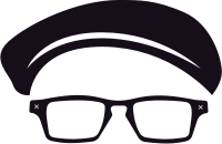
Not your grandpa's comedy
TL;DR
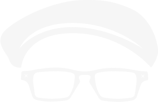
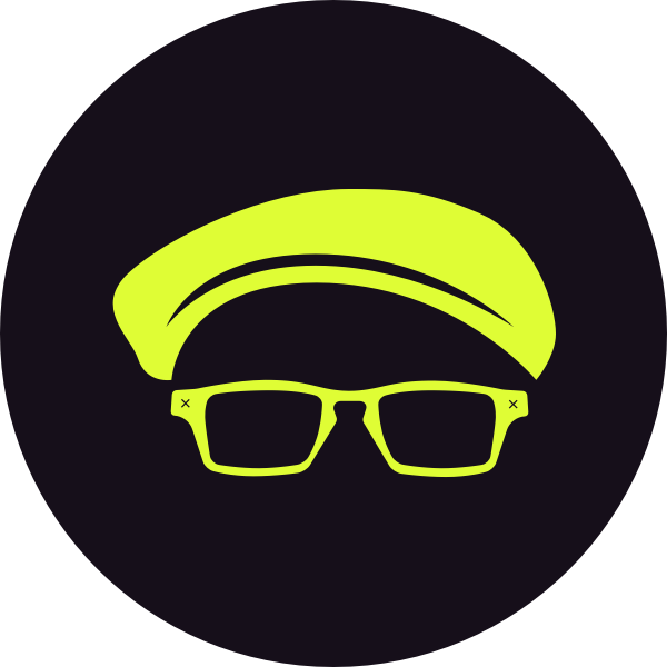
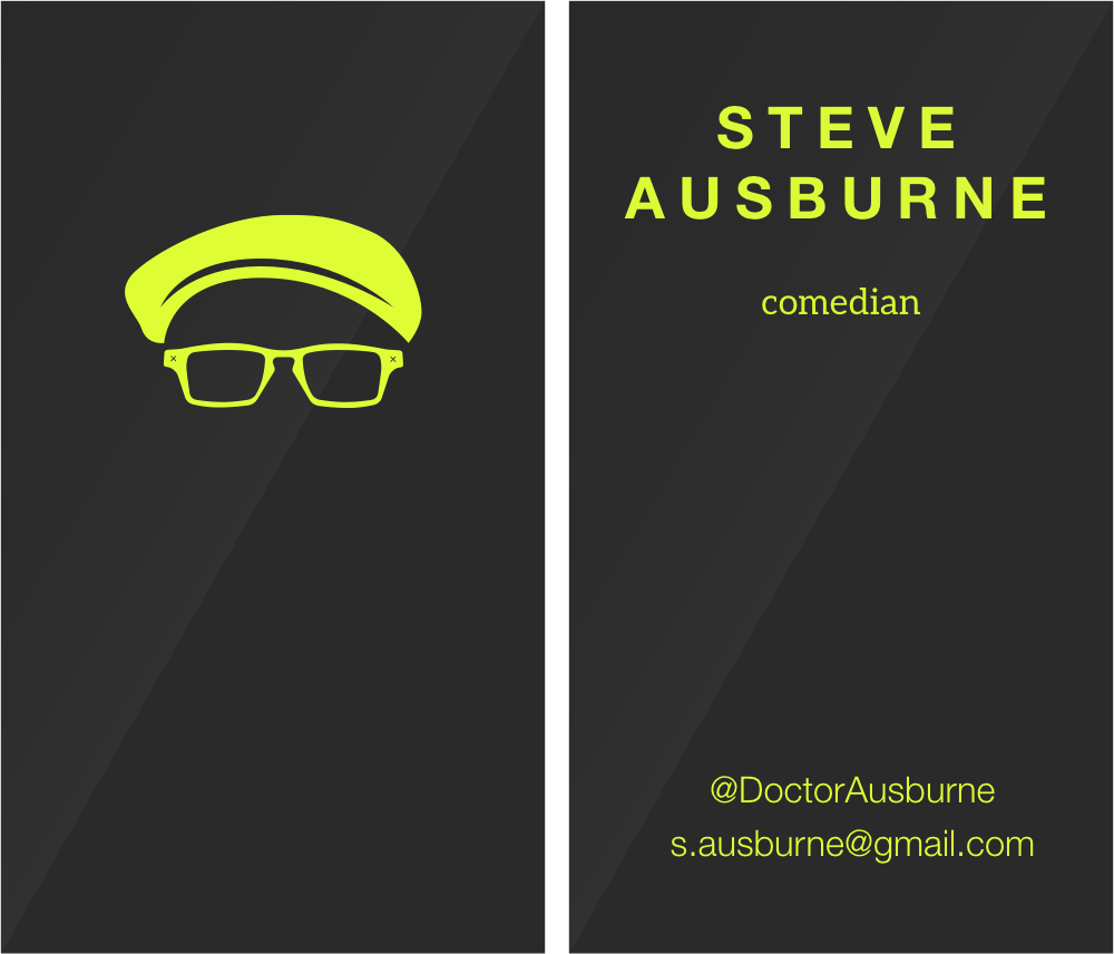
The mark consisting of a newsboy cap and spectacles is the personal brand of Comedian Steve Ausburne. The logo invokes Steve’s aspiration to be a new face in comedy. Bold and memorable, I left the jokes to the client and went strictly business with this minimal design.
Client
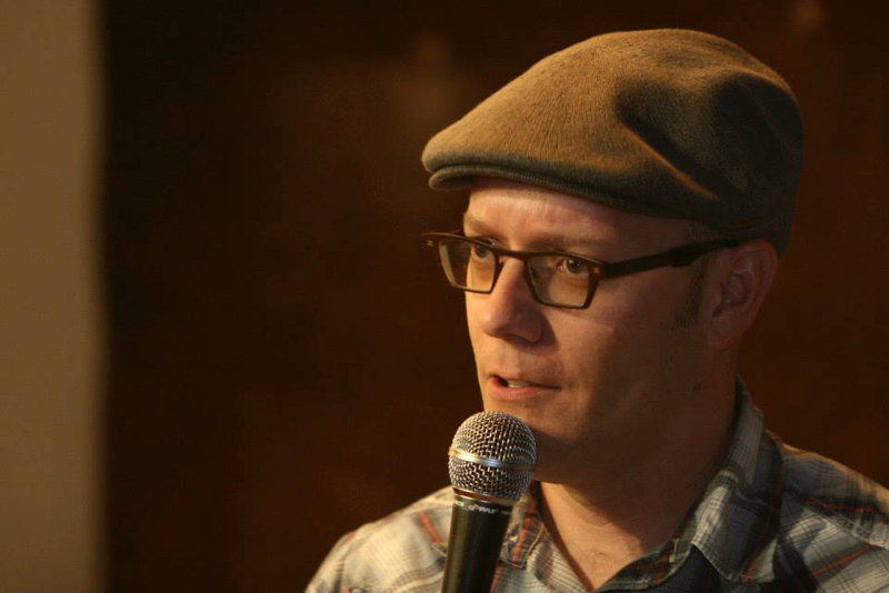
Steve Ausburne, Comedian
The Goal
Steve felt that a microphone had probably been done to death. He wanted something original and eye-catching without being overwhelming, and initially preferred black and white with a splash of some color.
- Focus-grabbing
- Iconic
- Minimal color palette
Solution
Create an instantly recognizable logo based on Steve's signature newsboy cap and glasses. The bold Chartreuse, is a departure from common colorways and embodies his desire to put a new twist on comedy.
- Distinct look
- Representative of Steve’s appearance
- Sharp contrast & bright color
Target Demographic
Steve’s comedy is not for everyone, but it is for anyone. I wanted the card to appeal to a wide variety of people because there is no telling to whom he will hand it out. It also needed to be something that doesn’t just go into your wallet and become one card of many. One look at the card and you know exactly who gave it to you.
Design
Approach
Some times the design is clear from the beginning. Such was the case with Steve’s logo. Working with images similar to the one below, I aimed to abstract his look down the core elements:
- Newsboy cap
- Signature spectacles
It almost never happens like this, but for whatever reason, I did not need to start on paper. I opened up a blank Sketch file at 3:00pm. The refined pieces of his look took shape over the course of two hours and by 5:00, I had the logo. Steve and I went back and forth on some color combinations, but shortly after the card was completed. This is a testament to the fact that the best designs are usually the most simple.
Testimonial
"I asked Bryce if he could design a logo for my business card and as a stand up comedian, I wanted something that was eye catching but also captured my style/personality. I gave him a few bits of information about me and my interests and said that I have a preference toward a minimalist approach. On the first pass he provided mock ups that nailed exactly what I was looking. His use of negative space gave me a design that is instantly recognizable and is featured on not only my business cards, but myriad other promotional material. Now, if only my act was as cool as my logo..." - Steve Ausburne

Close
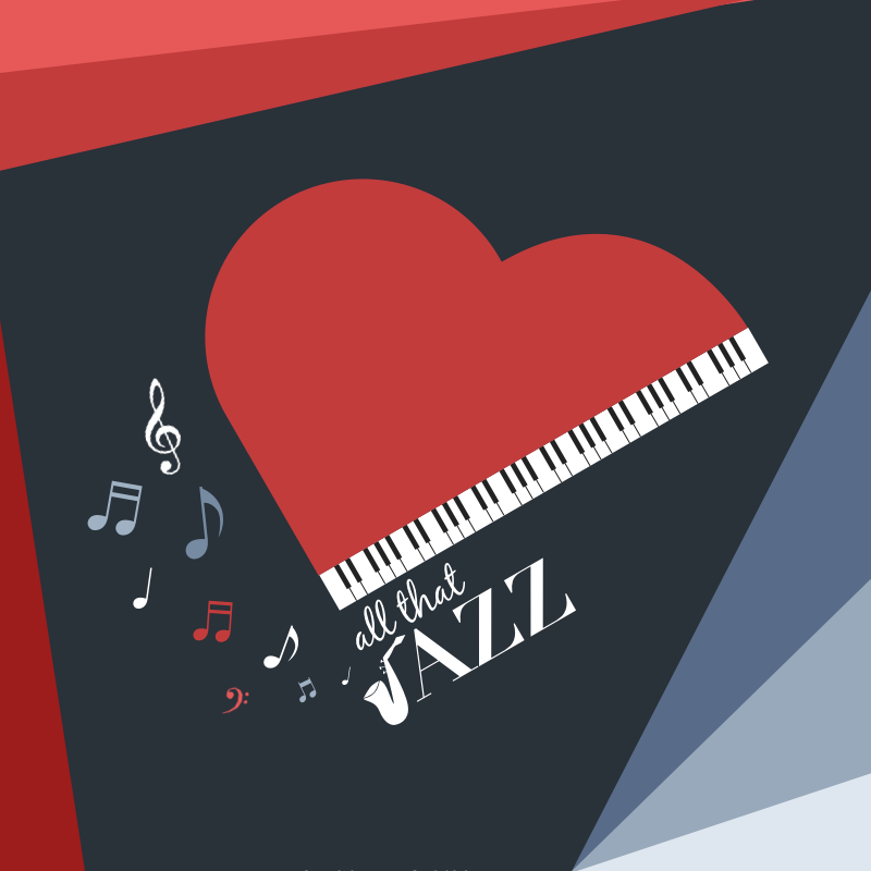
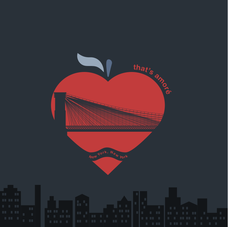
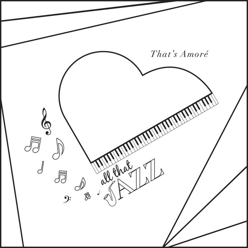
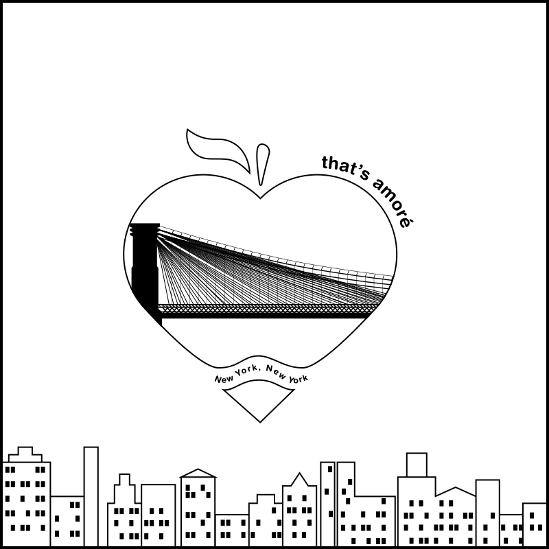
That’s Amoré
Annual fundraising event
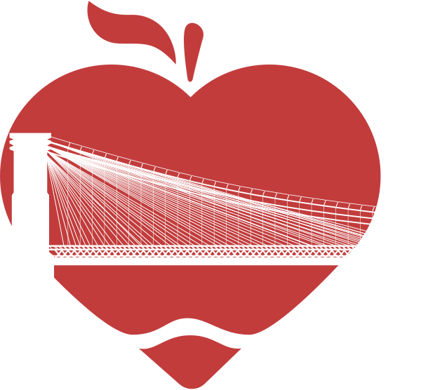
TL;DR
That’s Amoré is Heritage Christian Schools’s largest annual fundraiser. The project came to me two years ago from past client and friend, Emilee Hurlbert. The two themes All that Jazz and New York, New York needed to fit within the overarching love theme. Working with the universal symbol of love, the heart, I have created two logos distinct in their own right, but cohesive in this continually-growing set.
Client
Heritage Christian School
The Goal
The school only had a few requirements:
- Incorporates the main and sub theme.
- Logo can be used for coloring contest
Solution
Create an adaptable set of iconic logos that conveys both a sense of Amoré and the different theme. I also provided a line version to be used for the coloring contest.
- Heart turned into a piano for the Jazz theme and an Apple for New York.
- Coloring contest ready
- Friendly & inviting
Target Demographic
The logo needed to appeal to the parents of the students, as they are the ones the school is asking to open up their hearts and wallets for donations. It needed to be very friendly, inviting, and covey the idea of love.
Design
Approach
For both designs, I began with the simple heart shape below. I wanted Amoré to be the focal point of the design, and for everything else to spring from this. The All that Jazz event was inspired by album artwork with musical notes and more abstract blocks of color. The heart takes its form in a grand piano.
For the New York, New York design, I emphasized some of the trademarks of The City. The Brooklyn Bridge cuts through the apple that also doubles as a heart.
- Heart-inspired piano and apple
- Distinct hallmarks of each theme.
Testimonial
"Bryce Daniel is a joy to work with! He designed the logos for our annual fundraising event the past 2 years. Working off of little more than an event name & yearly theme, he created beautiful logos that we used in every print piece as well as on our website & social media platforms. Bryce is incredibly gifted and easy to work with. He readily honors client requests, though you won't have many if you let him do his thing. In Bryce you get not only an incredible designer and graphic storyteller, but also an amazing person. I highly recommend using him for your next design project." - Emilee Hurlbert
Close
PhotographyWork
Life in motion. Captured in stills
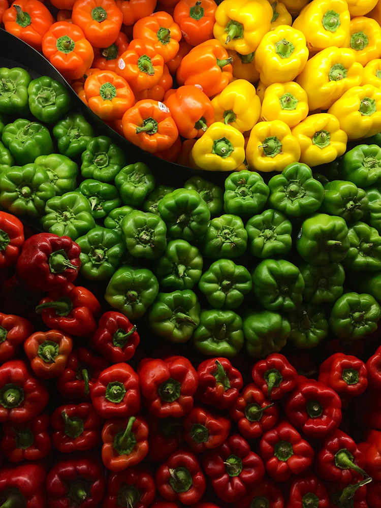
Eight Cuisine & Wine
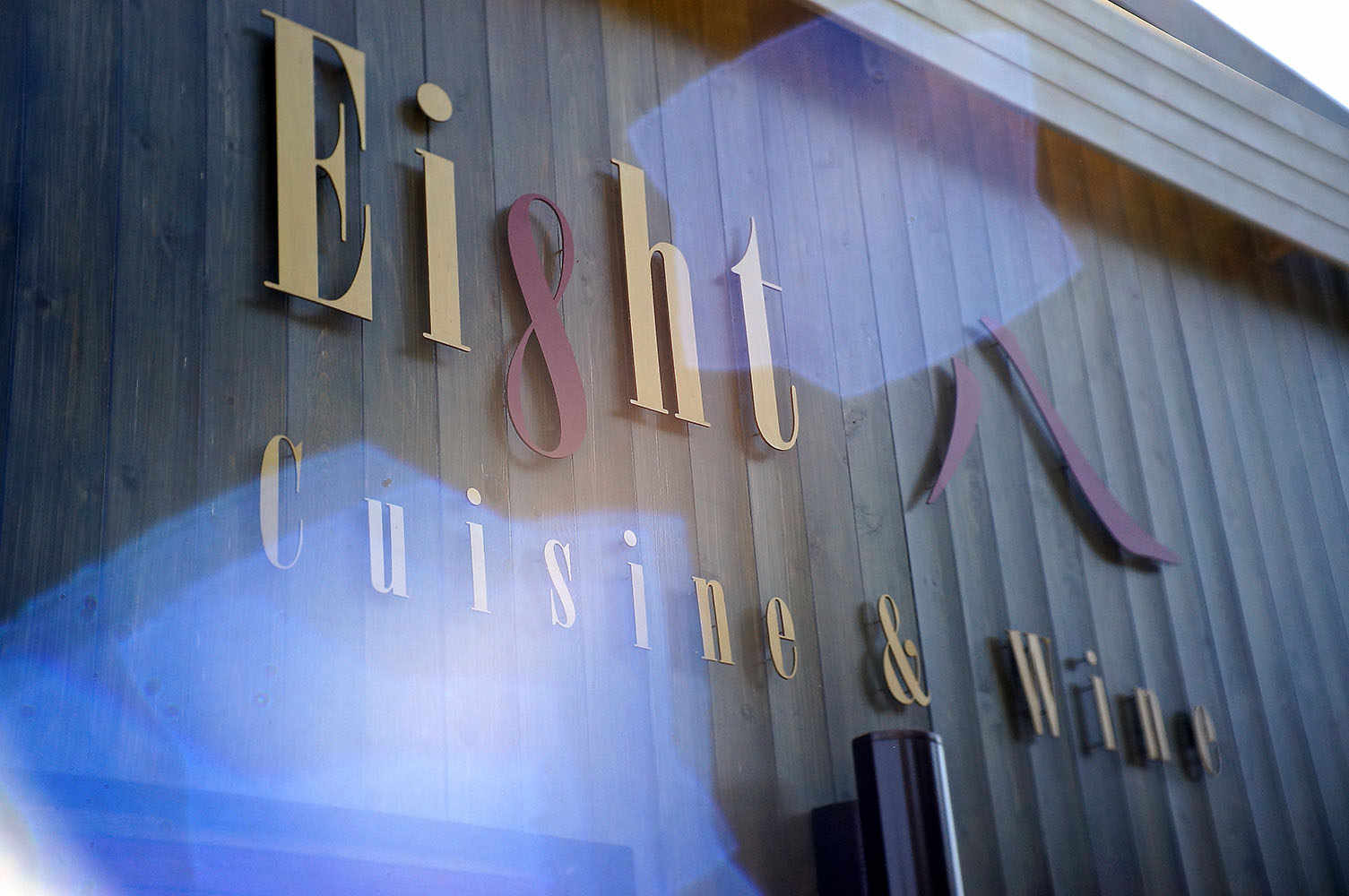

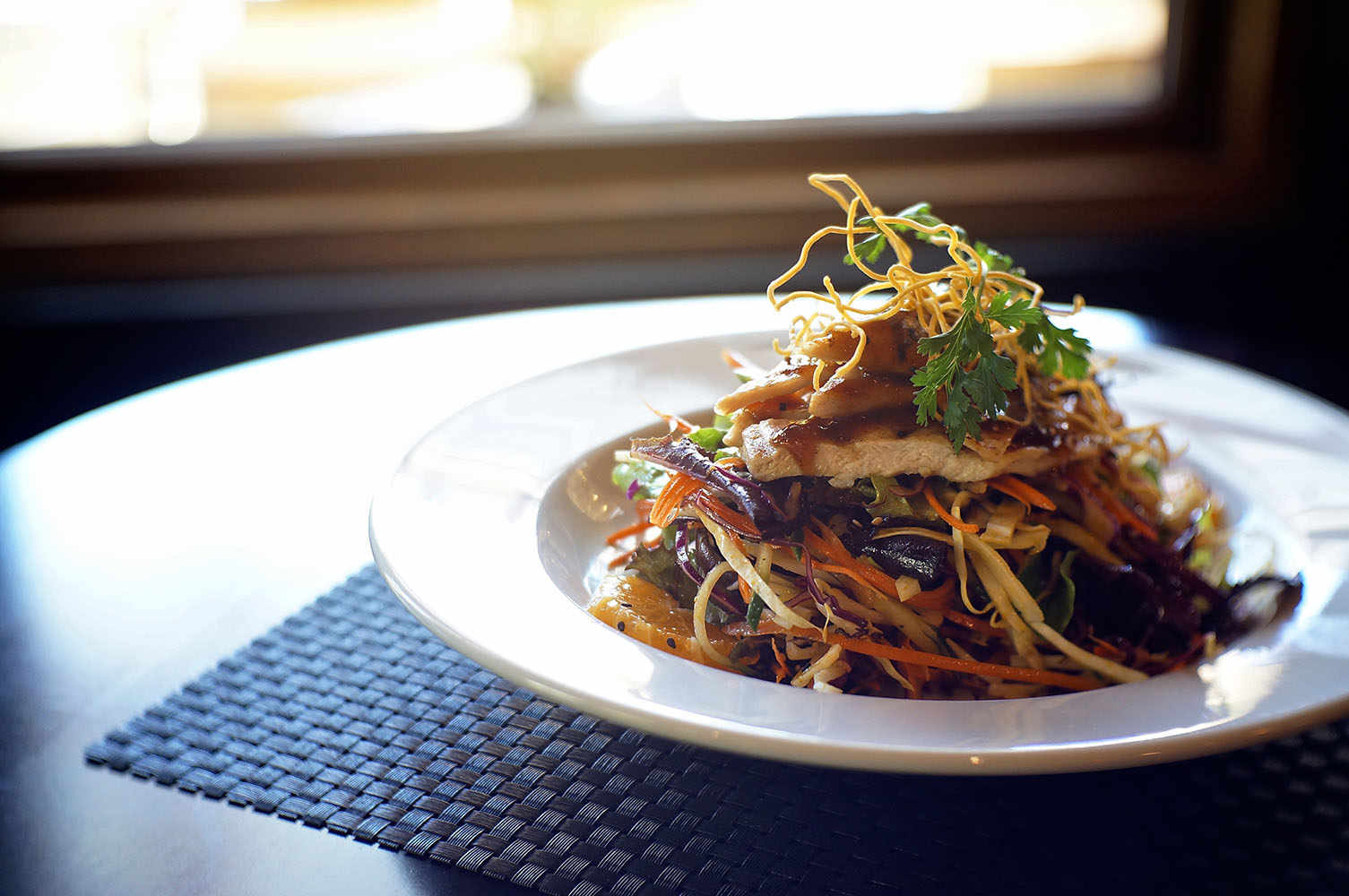
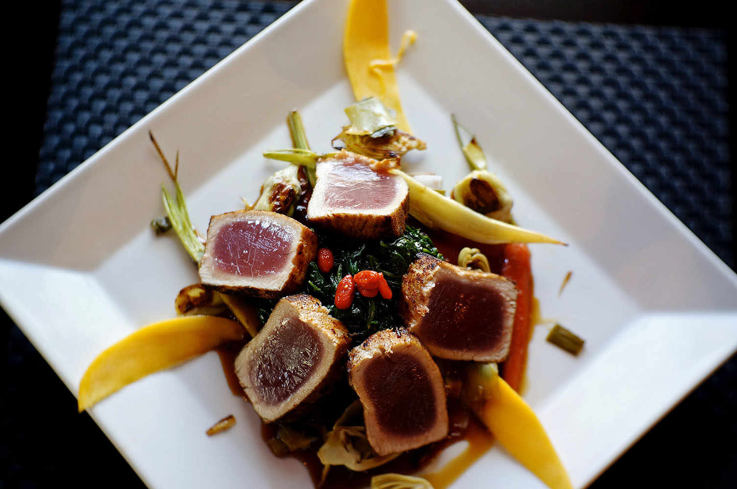

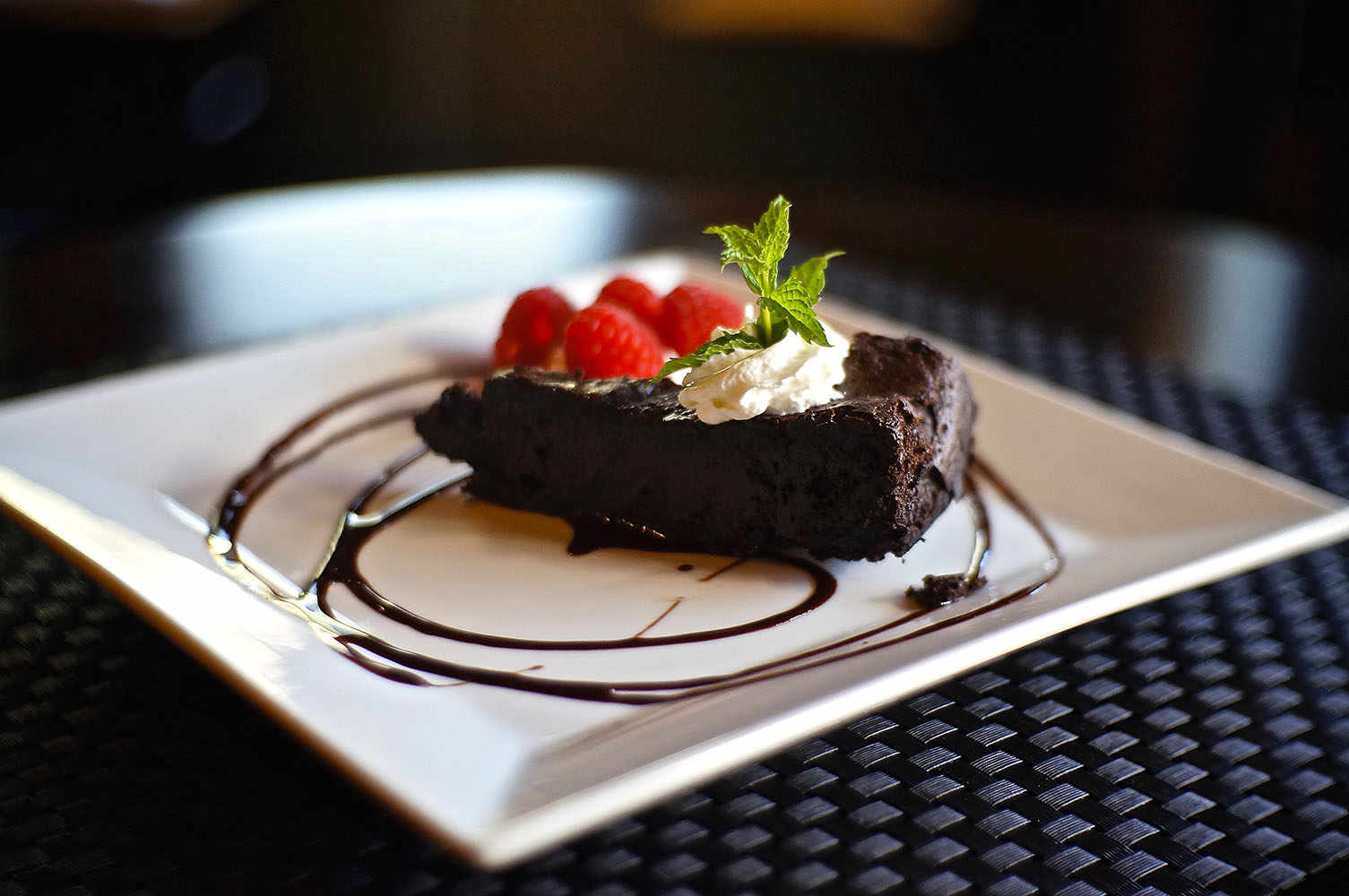
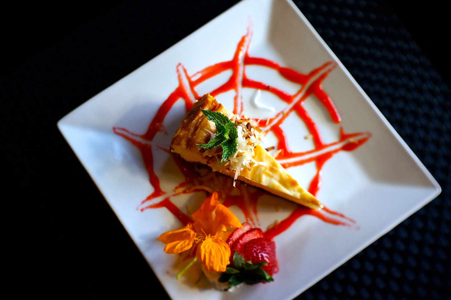
When Eight Cuisine & Wine updated their menu, they asked me to capture the rich textures and bright colors to display on the website.
Personal Work
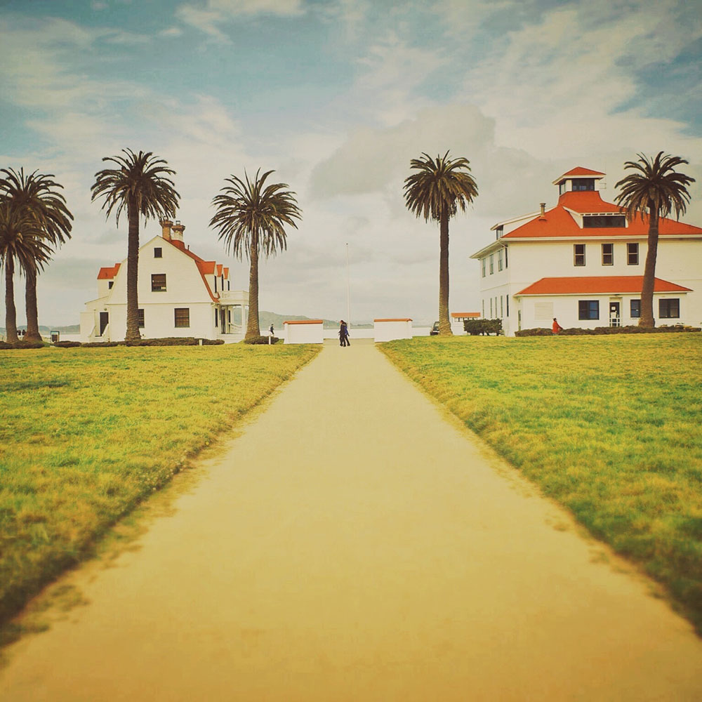
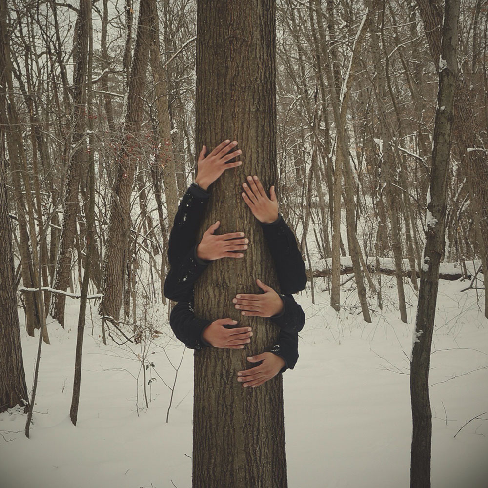
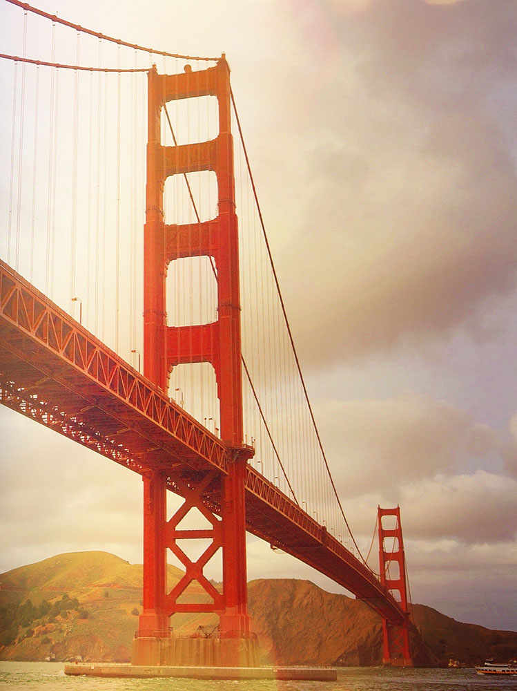
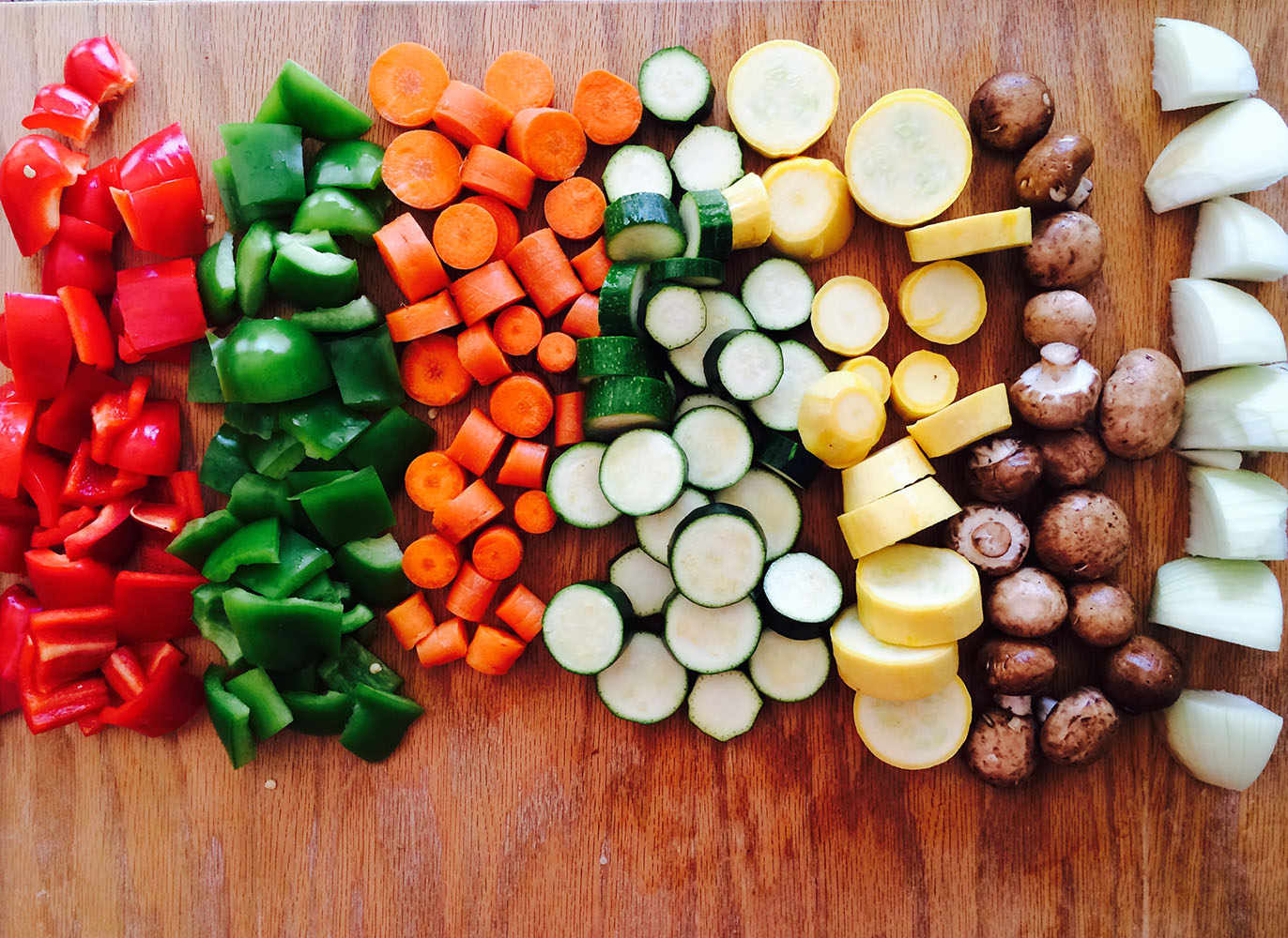
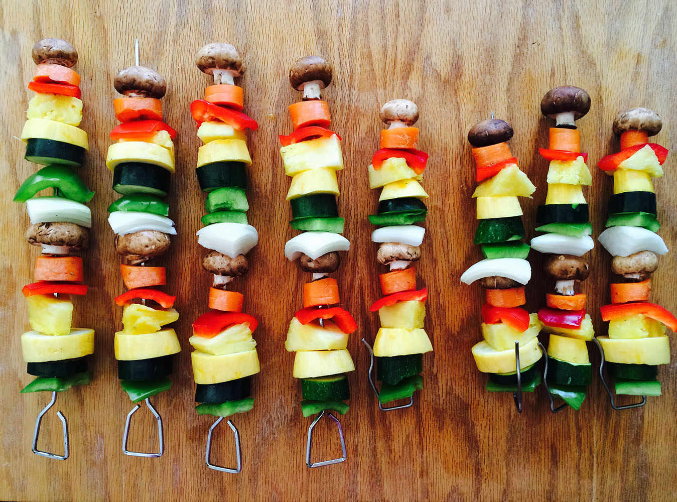

Sometimes I stumble through life camera first. For more of my photography, please check out my Instagram.
Close
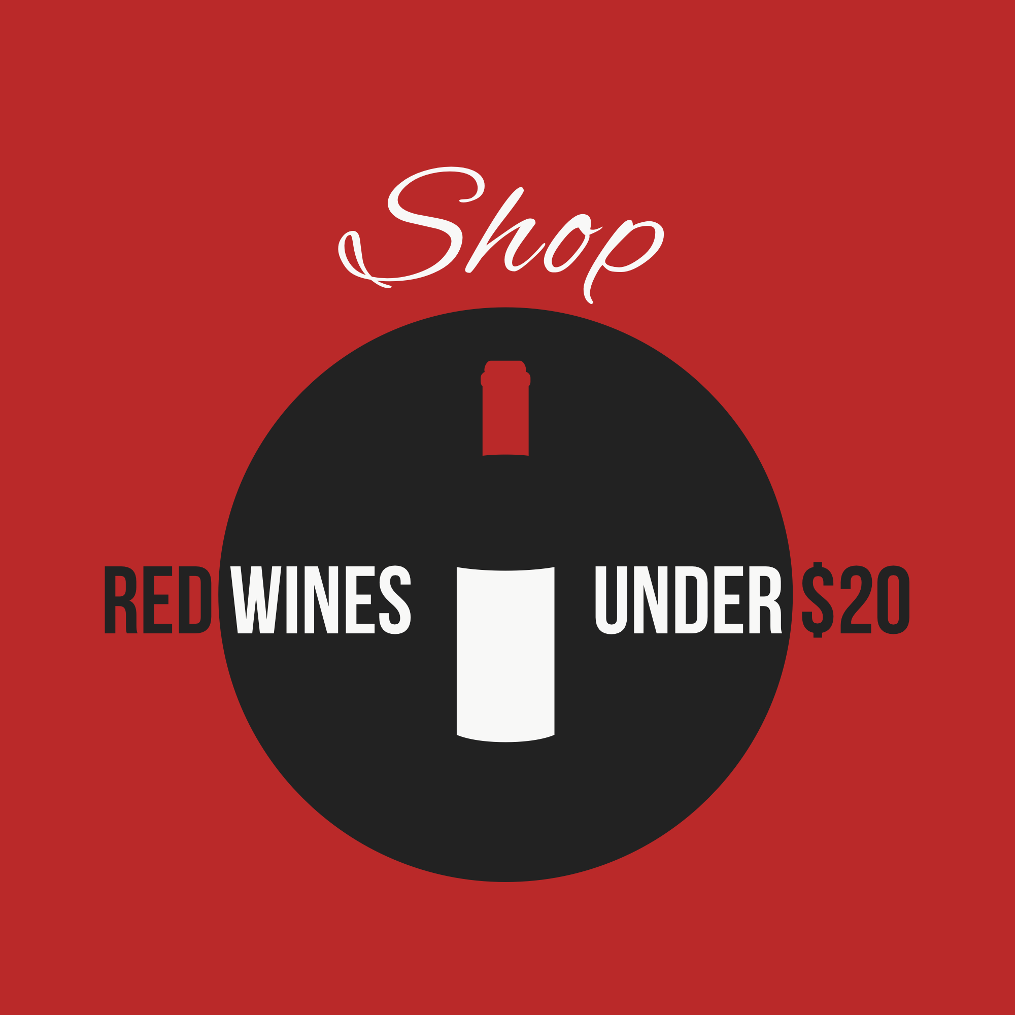
BrandingWork
That file labeled "other"
TL;DR
I have several years of work; I have tried to feature my more recent work, but here are some of the other things I have done.

Close
work
Contact
Ready to tell the next chapter in your brand’s story?
Let’s work together to create it.